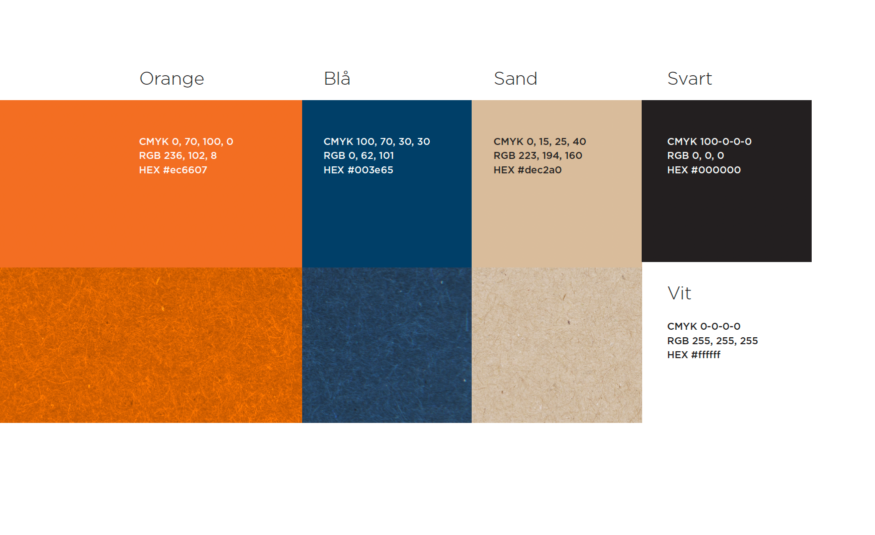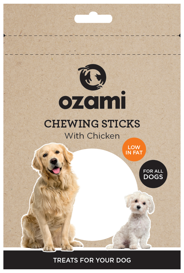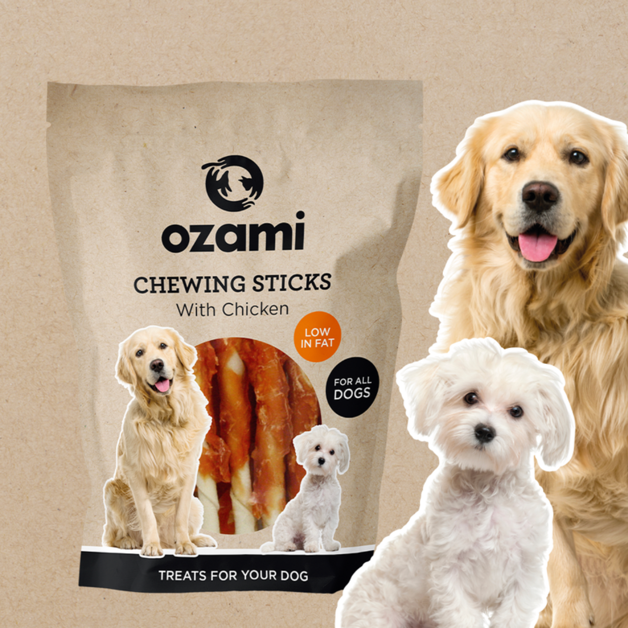
Using customer data, along with creative discussions and workshops with Ozami, we set out to develop a fresh brand identity. The goal was to convey professionalism and trustworthiness while maintaining a warm and playful character. We selected an authentic brown as the primary color, paired with blue, black, and orange as secondary colors. Retaining blue helped preserve the original brand recognition. We also chose pet images that customers strongly identify with—primarily common household pets.
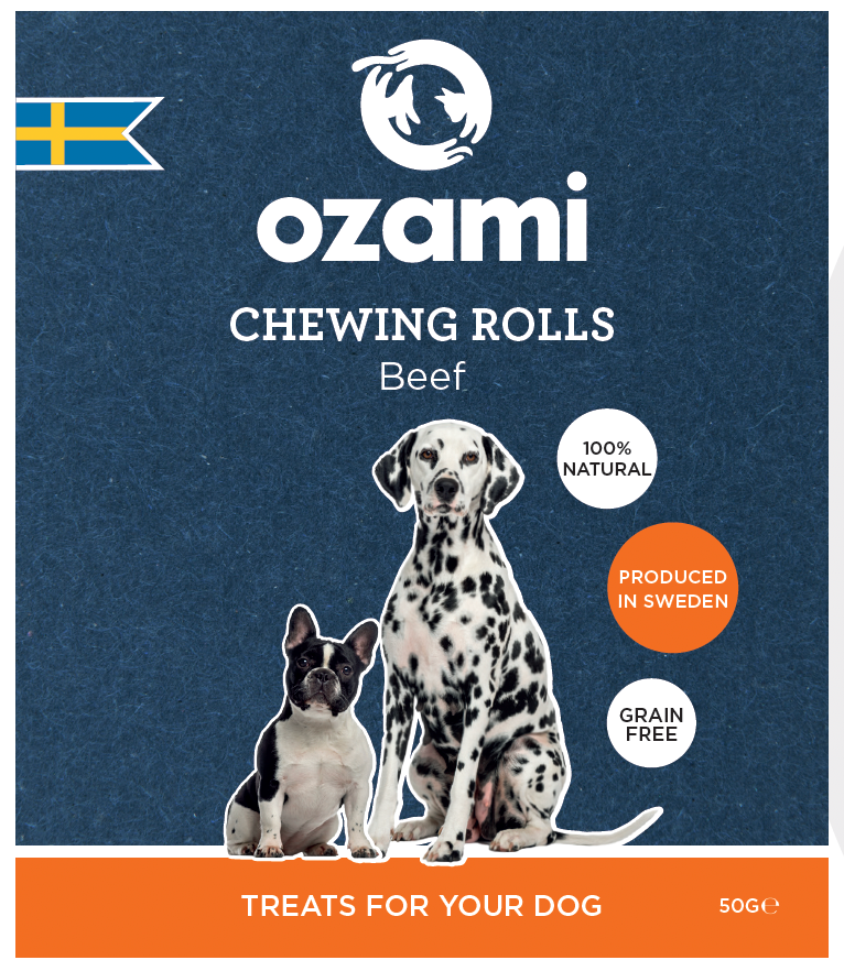
After establishing the overall identity, we rolled out a graphic manual and created master files for selected products. We also developed a set of icons and designed two product concepts:
Regular Range: Features a brown paper background, maintaining a friendly and down-to-earth feel.
Premium Range: Uses a blue label to stand out from the regular line, yet still stays grounded and not too “glam,” aligning with Ozami’s target audience.
This comprehensive rebrand ensures the new Ozami identity is modern, inviting, and memorable.
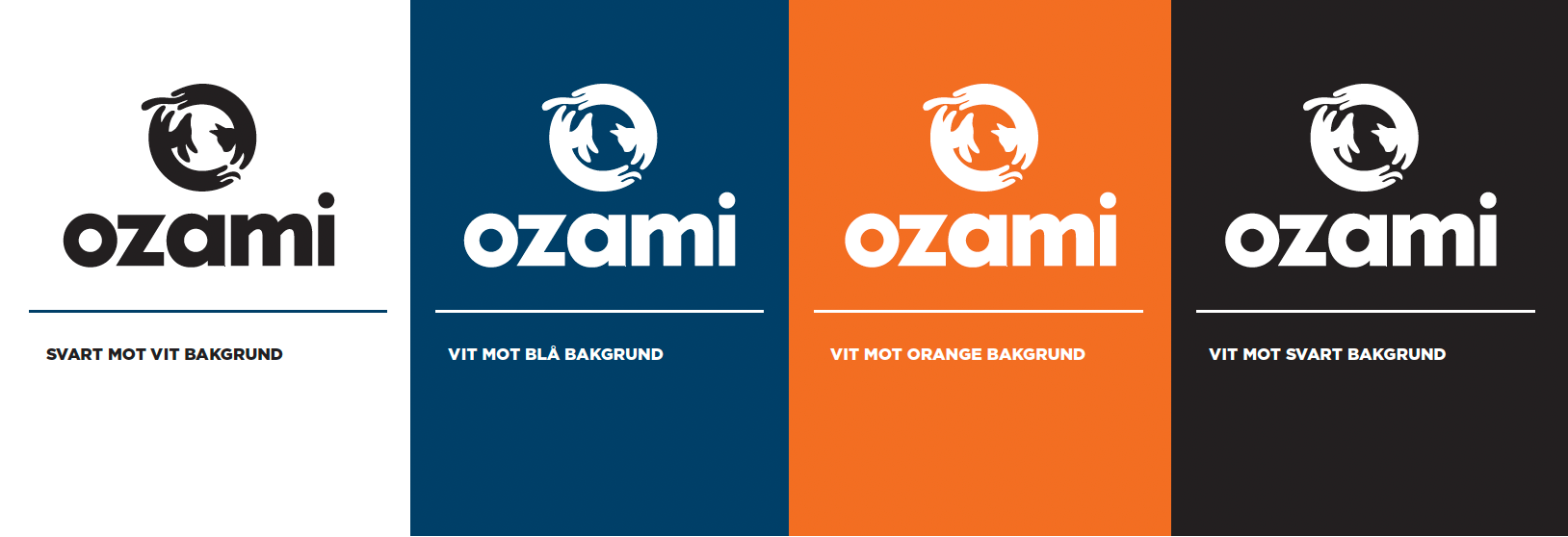
Old vs new logotype