Magnusson Minds is an independent law firm for which I developed both the brand identity and the website.
The Logo
The logo combines two “M”s to represent Magnusson Minds, blending a sharp, authoritative style with a softer, more philosophical one. The first “M” conveys seriousness and structure, reflecting the firm’s professionalism and credibility, while the second “M” is fluid and symbolic of an open mind — an essential value for Magnusson Minds, which strives to think differently and find innovative solutions.
The logo combines two “M”s to represent Magnusson Minds, blending a sharp, authoritative style with a softer, more philosophical one. The first “M” conveys seriousness and structure, reflecting the firm’s professionalism and credibility, while the second “M” is fluid and symbolic of an open mind — an essential value for Magnusson Minds, which strives to think differently and find innovative solutions.
Brand Identity
Our goal was to craft a professional yet approachable identity — one that balances trust and authority with a personal touch. While it was important to maintain the credibility expected of a legal service, we wanted to move beyond the typical lawyer clichés. The imagery avoids traditional “legal” symbols, instead opting for visuals that are engaging, relevant, and slightly unexpected. The tone of the language is professional but with a hint of quirkiness, often posing questions to spark curiosity and connect with the viewer.
Our goal was to craft a professional yet approachable identity — one that balances trust and authority with a personal touch. While it was important to maintain the credibility expected of a legal service, we wanted to move beyond the typical lawyer clichés. The imagery avoids traditional “legal” symbols, instead opting for visuals that are engaging, relevant, and slightly unexpected. The tone of the language is professional but with a hint of quirkiness, often posing questions to spark curiosity and connect with the viewer.
Dark blue was chosen as the core color to represent professionalism, loyalty, and trust. To balance this, we introduced grounding earth tones, adding a calming, approachable element that sets the firm apart from more traditional law firms.
The Website
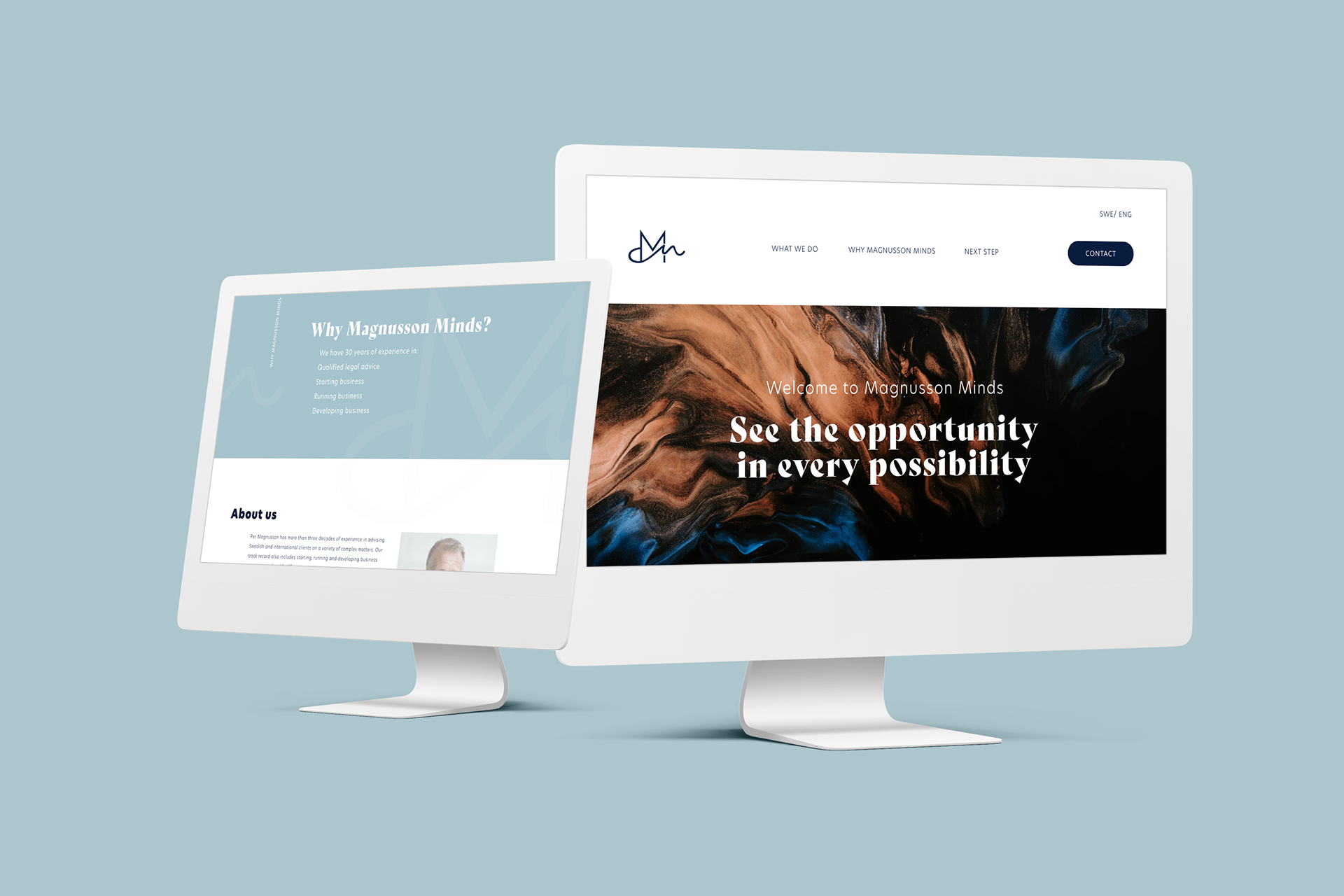
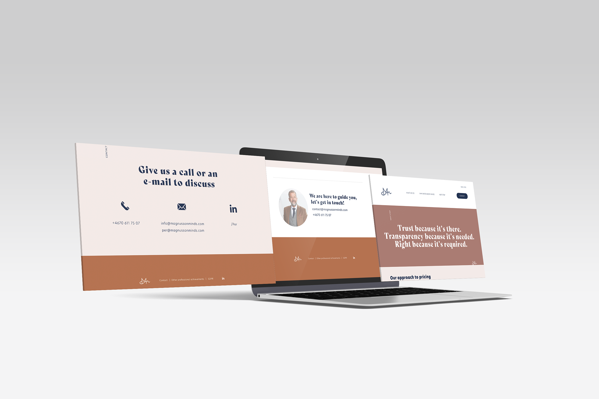
The website design aligns with the established identity, featuring a minimalistic UX and consistent use of the brand’s color palette. The imagery is inviting and distinctive, further reinforcing the firm’s unique character. The navigation menu is streamlined with just three key pages: “What We Do,” “Why Magnusson Minds,” and “Next Step?” — a simple yet effective structure that covers all the essential information while maintaining a user-friendly, focused experience.
The website design aligns with the established identity, featuring a minimalistic UX and consistent use of the brand’s color palette. The imagery is inviting and distinctive, further reinforcing the firm’s unique character. The navigation menu is streamlined with just three key pages: “What We Do,” “Why Magnusson Minds,” and “Next Step?” — a simple yet effective structure that covers all the essential information while maintaining a user-friendly, focused experience.